Apple’s Freeform won’t be changing the face of collaboration
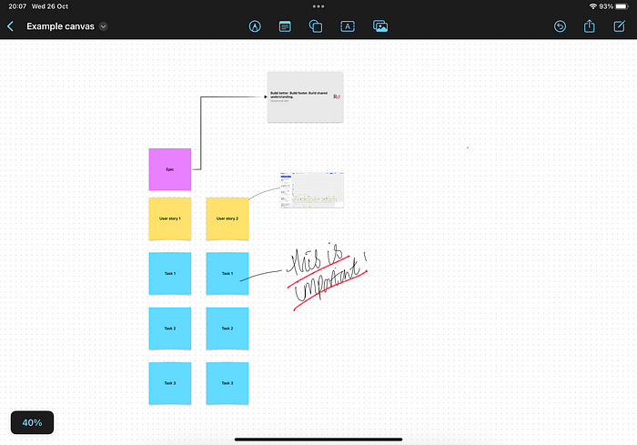
When Apple announced iPadOS 16 one of the features that interested me was a new app called Freeform which promised to be a collaborative infinite canvas that made use of features like Facetime on the iPad for a more native real time experience.
This meant that Apple were getting into the infinite canvas space, a space that proved to be quite lucrative when everyone found themselves working remotely when Covid-19 hit.
Having such a tool built into the iPad would mean that companies like Miro, Mural and Figjam would suddenly find themselves having to compete with a free alternative with built in integration with the rest of the iPad’s functionality.
Having now played around with Freeform I think that those companies have nothing to worry about.
Freeform’s UI hides core functionality
Apple has always been seen as a company that puts a lot of effort into perfecting the User Experience (UX) of a product so I have no idea how they’ve managed to make Freeform so hard to use.
The core tasks that one would expect to do when collaborating with others would be:
- Create an object on the board
- Create a connection between objects on the board
- Annotate that connection so there’s context about that connection
Miro does a really good job of enabling this flow, providing anchor points for a user to drag a new connection from a source object to another object on the board and then enabling a user to add text to that connection by double clicking.
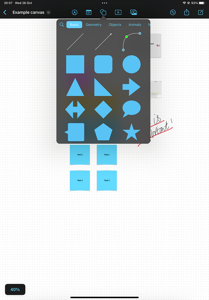
Freeform does make it easy to add an object to the board with a top toolbar that offers drawing, sticky notes, ‘objects’, text and images. Unfortunately they’ve hidden creating a connection between objects under that ‘objects’ item and the popover menu for that item has multiple categories for shapes which makes it incredibly easy to miss the connection creation options.
Freeform doesn’t offer a context based means to create that connection either so your only way to link two objects on the board is to create a new connection object and drag the anchors to the two objects you want to link.
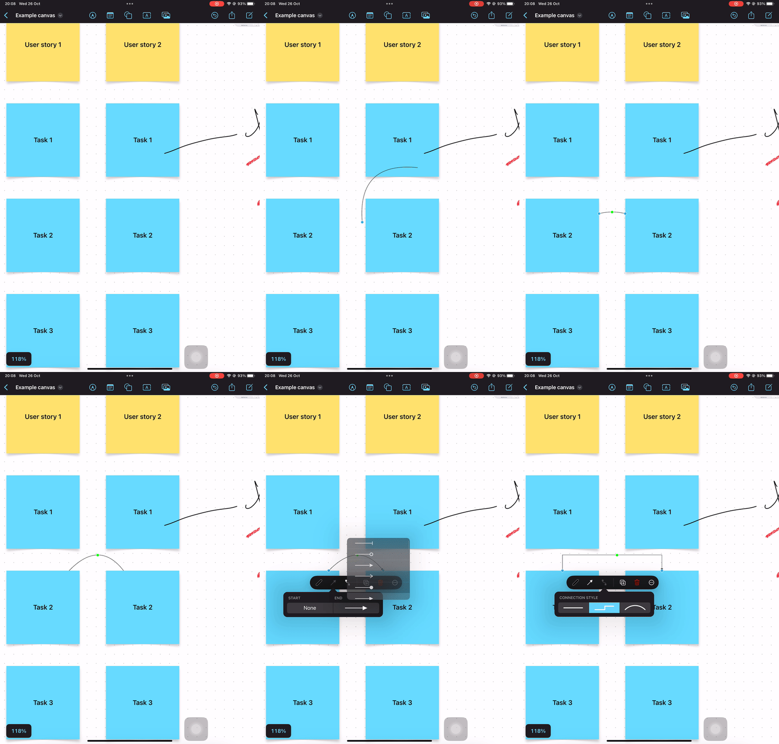
There’s no means to annotate the connection between two objects so you’re stuck having to move a text object near the connection and hoping that you don’t move those objects.
Apple have completely missed the point of a collaborate whiteboard
Unless the team have a really solid retention of all aspects of the topic they’re discussing then it’s likely they’ll have information captured in another tool that they’ll want to bring onto the whiteboard in order to link it to others or just to serve as a reminder.
An example of this that springs to mind is the Card object in Miro and the Jira integration that allows teams to pull in Jira tickets in order to discuss them and thanks to a two way link there’s a means to update the ticket in Jira from within Miro. This gives teams a way to take the structured data within Jira, have an unstructured conversation about that item and then record changes back to that structured data source.
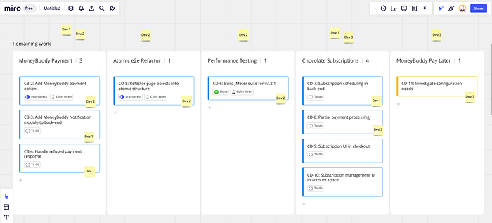
Freeform offers no such functionality, so users are stuck using sticky notes, text and images/videos to manually rebuild this information on the whiteboard and then someone will have to distill any new information into the existing data after the collaboration session.
Freeform does make whiteboard objects accessible
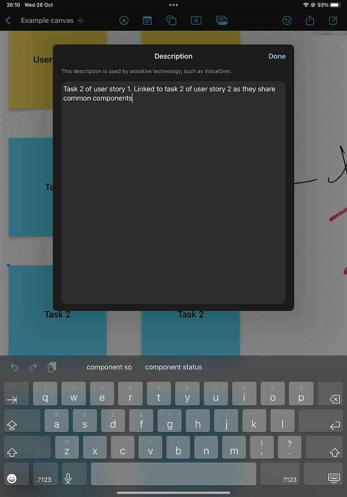
One feature I found in Freeform that I’ve unfortunately not seen in other tools is the ability to define accessibility descriptions to items on the whiteboard. This means you can provide a lot more contextual information against a board item to help those with accessibility needs to understand what that item is and how it links to other board items.
Summary
I’m a little disappointed with Freeform and I don’t think it’s going to be yet another Apple bloatware app that gets deleted when someone buys a new iPad.
In the marketing, Apple claim that the app will aid collaborative productivity sessions between teams but Freeform will be more of a hinderance with each team member requiring an iPad, iPhone or Mac (there’s no Web version planned from what I’ve read) and having to copy information from and to existing data sources in order to be productive.
Given the fact that competitors to Freeform such as Miro offer free-tier plans, have web-apps and apps on the iPad (although I imagine Apple will start chipping away at those) I think it’s going to be a hard sell to use Freeform for anything ‘serious’.
